Formulaire d'inscription sur les affaires.com, première étape

Un exemple de formulaire de commentaire mal conçu

L’autre jour, je suis tombé sur l’article de Stéphanie Kennan, Savoir-vivre sur LinkedIn: soignez votre présence, que j’ai trouvé très intéressent, jusqu’à me pousser de laisser un commentaire. Je vous avoue, c’était ma première visite sur les affaires.com, alors, je ne savais pas à quoi m’attendre.

Je clique l’icône Commenter en bas de l’article et je tombe sur une page qui me demande de m’inscrire ou de m’identifier.

Ayoye! Ça commence mal…

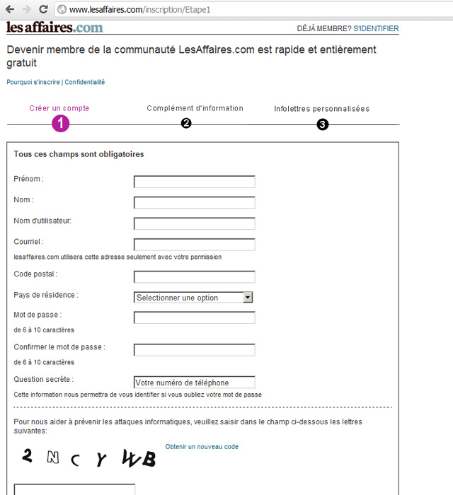
OK, j’ai été encore assez enthousiaste pour cliquer le lien pour m’inscrire et là, je tombe sur un formulaire en trois étapes avec pleines questions obligatoires :

Formulaire d'inscription sur les affaires.com, première étape

Vous pouvez le deviner, j’ai été ben dégonflé. Tout mon enthousiasme a été en train de s’évaporer et je n’avais aucune envie d’écrire quoique soit, mais j’ai été curieuse de voir jusqu’à où cette aberration peut aller.

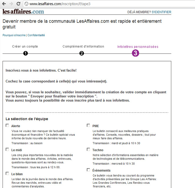
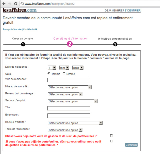
Alors, j’ai rempli les questions dans la première étape et voila, dans la deuxième pas, les affaires me pose un autre paquet des questions inutiles, cette fois-ci il m’oblige pas de répondre, mais nous sommes encore, en plein, dans la perte du temps des lecteurs.

Formulaire d'inscription sur les affaires.com, deuxième étape

Dans la troisième étape, on va choisir l’infolettre.

Oh! C’est cool! Des infolettres personnalisées! Je ne savais pas, qu’est-ce que manque de ma vie, encore une infolettre!

Formulaire d'inscription sur les affaires.com, troisième étape

Entre temps que j’ai passés à travers les différents choix, j’ai oublié une bonne partie de ce que je voulais écrire comme commentaire.

Comme coup de grâce, à la fin de ce calvaire, je m’attendais d’être déjà connecté, après tout, j’ai répondu à toutes les questions obligatoires, mais non, les affaires.com me demande de m’identifier…

Un peu plus sur les affaires.com

Pour ceux qui ne sont pas de Québec, voici un extrait de leur site :

« La plus importante salle de rédaction spécialisée en économie du Québec. Plus de 30 journalistes, ainsi qu’un réseau de pigistes et d’experts reconnus dans le milieu des affaires.

Plus de 300 000 visiteurs uniques par mois, qui totalisent 3,5 millions de pages vues. »

Je ne sais pas si quelqu’une a remarqué, les commentaires sont presque introuvables sur ce site.

Alors, si vous voulez que le monde laisse des commentaires sur votre site, s’il vous plaît, évitez d’emmerder vos lecteurs.

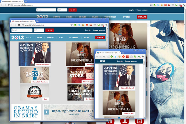
Barack Obama is responsive…

…well, at least the new version of his website it is.

As you can see on this picture below, as the browser window is shrunken, the layout will adapt, by reducing the size of the images, the way they are presented and if we go really small, you will see major changes in the navigation too.


You can try it out for yourself by resizing your browser window.

The website was developed with a “mobile first” approach, meaning that first of all, the website had to look good and to be easy to navigate on a mobile phone. Once that is sorted out, they move up to larger screen sizes. Here is a short interview with the head developer and the design director of the new BarackObama.com.

Let me finish this post by paraphrasing a famous speech:

I have a dream that one day the web development community will rise up and live out the true meaning of the Internet: We hold these truths to be self-evident, that all websites are created equal. Free at last! Free from the slavery of App stores!

Why not to use Flash for your portfolio

Do you remember the day when it was cool to have a Flash intro on your home page? All the creative people were trying to outdo each other and to come up with more and more complex animations, spiced up with sound effects and music that would enforce the visitors impression about the owner’s good taste.

I can see you’re nodding… Those were the days…

But than, people started complaining about the background music, and would find it too intrusive. Music got muted by default and sound effects slowly, but steadily disappeared as an accessory for web design. It didn’t took too long to realize, except all the self-absorbed “geniuses” and misguided clients, that Flash intros are a huge waste of time, they are not accessible and have zero SEO value, not to mention the high bounce rates.

Good!

The other day I clicked a link shared by a friend on Facebook, it was the portfolio of a photographer with a series of images shot in India. It was done with Flash, the fancy way, I could click back and forth, there was even a full screen mode or I could just sit back and let the slideshow play. I did not had a lot of time, I wanted to quickly go trough the images, but I couldn’t. The pictures would appear one after another, with a loading counter between them, but what I wanted to have a general view and not to be forced to wait.

Today there are less and less devices that play Flash, even Adobe stopped developing the mobile version, so why put your eggs in a basket that is sinking?

Web accessibility, a case study

Developing an accessible website

We’re getting there, the website is in its final phase of development and polishing. The launch date is getting closer and closer and we want it to be perfect. Of course, the many years of designing for the web, taught me that there is no such thing as perfect when it comes to websites. The good thing bout the Web is that it’s a platform and a product that can be tweaked and improved even after it lives in the public realm.

From the very begging of the planning and development of the website, we wanted to make it accessible. Everything was checked and double checked, to make sure that the design, the navigation and the content will make sense for a person using a screen reader.

The technology

Our choice of Drupal as a CMS, proved to be the perfect match for developing an accessible website. It comes with many built in functionalities that help develop accessible websites.

There are other CMS-es too that you can use to make accessible website, the tool is not as important as the way you implement it and use it.

The design

Everything on the website has to have a meaning, we reduced the number of decorative elements to a minimum, in order to speed up the loading time and also to direct the attention of the visitors to the main content.

The color scheme, while following the visual identity guidelines of the City, it is used in a way that even color blind visitors will be able to navigate it. The contrast is high enough that even users with poorly calibrated screens will understand the structure and the navigation.

Links in the content are underlined and in the navigation, there are visual clues to highlight a roll-over or an active link.

The navigation

While we were working on the tree view of the navigation, we organized the links in a logical way. Ulterior testing with users helped us fine-tune it even more.

The first link screen readers will get is a “Skip to content” link, that helps the users skip the whole navigation of the page and get to the juice of the content. This is hidden for other users, not to clutter the menu and unnecessarily confuse people.

On the bottom of the page there is an expanded sitemap with the main pages organized by section. This is to help people navigate the site without having to deal with the drop-down menu.

The content

The content is organized with headers, to give a logical hierarchic order.

Illustrations, all have alt attributes, where there is a description of the image for the screen reader. It was quite funny to see that the blind lady, who was so kind to accept to test the website, had found a typo in one of the alt texts. Something that we overlooked, she was fast to find.

Tables are used only for tabular data only, there is no table used for design. They are structured with thead and tbody, as well as with th and td, to make a clear distinction between table heads and the rest of the tabular data.

We built the forms in a way to make it clear for the screen reader what is the label for the input.

The test

Testing was a very important part of our development. Having the website tried out by people of different age group and different familiarity with the Internet, gave us important clues about how to tweak the website to make it better. We had one test subject who is using a screen reader and she loved the website, she had no problem navigating and understanding the content of the site. There was one exception, that we’ll have to sort out in the coming days, before going live with the website.

Conclusions

The first step is to recognize the need to pay attention to it, at the very beginning of the project.

Think of the user who can’t see the website, or can’t identify colors, or even the one that can’t use a mouse to brows, how will they see or navigate the content? Answering this questions will have a huge impact on the wireframe and the layout mock-ups.

Following web standards will already place you on the right track, but there are other great resources to learn about accessibility. I learned a lot from WebAIM, they have a great collection of resources and articles about how to build accessible websites. Of course the W3C WCAG 2.0 is the ultimate source of web accessibility info and if you live in Quebec, you should follow the standards developed by the Gouvernment (in French only).

The good news and the bed news is that, even after the development of the website is done and all the initial content is integrated in an accessible manner, the job is not finished. There are always tweaks you can do, to make it better and if you are not the only person contributing with content to the website, be prepared to give proper guidance to the other contributors about accessibility.

The cherry on the top of the cake

If you have a hard time convincing your client or boss, about the importance of accessibility, tell them that Web Accessibility is not rocket science and it’s not difficult to achieve. If they still don’t listen, you can always pull out the ultimate ace, Google is the biggest blind on the Web, so you better make it accessible if you want to have a decent ranking.
The New Yahoo! Mail Beta

What’s New in Yahoo! Mail beta

The New Yahoo! Mail Beta

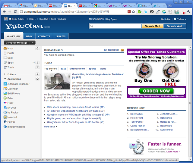
The first thing you see after logging in

Yahoo! is not among my favorite brands online, although I do use it a lot for catching up on international news. I saw on the Yahoo! Mail blog that they are working on a new version and there is a beta out there for the larger public to mess with. You can imagine I could not resist to the temptation to give it a spin. Here are a few impressions:

  • The design is bold, in line with the design I saw earlier on the Yahoo! News Canada: dark blue header, a search box that stands out and large tabs that makes navigation easy. I’m not a big fan of Yahoo! News Canada, it always gives me the impression that in terms of content, it’s  more like a watered down version of its international counterpart.
  • Once I logged in, to my great disappointment, I was still taken to a What’s New section, see the screenshot above. There is a preview of my Inbox, a Top News section, a large (300x250px) ad selling me a gadget to control snoring and a Trending Now block. Apart from the preview of the inbox, all the others are wasting my time. If I log in to my email, I’m expecting to read my emails and not to see the latest news and to find out that Miley Cyrus is trending on Yahoo. The advertisement I can forgive, since that’s the one that pays for my email and let me give here a small tip to Yahoo, I don’t have a snoring problem and I’m not looking to loose weight neither.
  • I do like that there is an inbox tab and more especially a contacts tab, with the current official version of Yahoo Mail, it took me months to get used to finding the My contacts link.
  • Once you’re inside, they’ve changed the way your online contacts will show and the icons are redesigned.
  • The black buttons to write a new message and other actions related to messages selected, I find them too harsh.
  • The header of the table that shows the list of messages looks like another email and it’s confusing.
  • The flagged messages are somehow better now, because the icon is more visible, but it’s still pushed to the right as the last column and I find that it doesn’t stand out. I flag my messages when I want to remember something, and I want them to stand out next time I log in. I would suggest Yahoo, that apart from having that orange triangle hidden in the extreme right, make the background of that flagged row a different color, maybe a light orange, or a light blue to be less harsh.
  • For reading and writing emails, the interface is cleaner, but the black buttons on the top are still ugly…

These are just a few impressions I jotted down, without going into details. It’s still in beta and I can see they put into it a lot of effort to make it more up to date, but someone up there at Yahoo loves clutter and loves noise. The title of this post should be a hint to Yahoo to get rid of the What’s New tab. I’m not sure that clutter and noise is the best differentiating factor for their brand. There is so much talking about the fading importance of emails, that I don’t think they can afford to screw this up.

Do you use Yahoo! Mail? What do you love about it and what would you change?

How undergraduate students use the Web

The Nielsen Norman Group has released a new study yesterday, that is taking a look at how college students (18 to 24) use the Web. Some of the results are confirming my expectations: social network websites are not everything when it comes to the Web. Here are the main points of the findings:

  • Students are not necessarily technology experts – they are less intimidated by technology than older folks, but assuming that they know everything and they are willing to try out anything is wishful thinking. Interfaces that look intimidating, are usually ignored for fear of wasting time.
  • Multimedia should be used cautiously – Websites that play music or a flashing animation after load are considered to be of low quality.
  • Simple interfaces are preferred – here’s a quot that summarizes well this point: “stick to simplicity in design, but not be old-fashioned. Clear menus, not too many flashy or moving things because it can be quite confusing.”
  • They use social networks, but it’s not everything – most of them tend to keep one or two tabs open with a social network website, but when it comes to finding more detailed and accurate information, they will turn to search engines.
  • Reading – Long walls of text are intimidating, they prefer pages that are easy to scan. Many of them have trouble following a text with long paragraphs and complicated sentences.
  • Age-appropriate content – The younger the age group of your audience, the more important it is to better target the content and the interface. When it comes to students, of course this task is easier than with 7-year-olds. Still the results of the study advise having a special section of your website if you want to appeal to this age group. For example if a company would be interested to attract interns or graduates, they should not write the job description the same way as they would for others.
  • Students have a an eye for ads – they are fast to spot an advertorial, not easy to be fooled with cheap tricks.

The study claims that there are no international differences, something that I have a hard time believing. It was conducted in North America, Europe and Australia, well, there is more to the World than that and especially when it comes to UI design, culture can have a big impact on the perception of a website. Another thing I missed from this study is the lack of mentioning of the Mobile Web. With all the smartphones and tablets would have been interesting to find out about their use by this age group.

The other day I was reading Google and the Rise of Facebook, by Brian Solis. He is seeing Facebook as the dominant presence on the Web, dethroning Google. He gives numbers and statistics of time spent on Social Network websites to support his argument. At the time I was uncomfortable with his argument, but now with these results from the Neilsen Norman study, I know what was the weak point in Brian Solis’s theory. The time spent on social networks is irrelevant, because the users might keep a tab open with Facebook all day long, or might be 24/7 connected trough a smart phone. The same way I could claim that we’re always on Google because our default search engine in our browsers is set to Google.

The way how Social Networks are used, or the purpose they are used for, is more important than how many people spend how much time on them.