The battle with cancer

I just learned about the death earlier this month of Montreal musician Catherine Potter. While Googling to find more info about her, I came across this article in The Gazette:
Musician Catherine Potter fused East, West and the first paragraph caught my attention:

The world beat music community is reeling from the death of Canadian artist Catherine Potter, who dedicated her life to the creation of a unique musical identity based on the fusion of classical Indian and western (jazz) music. She lost her battle with breast cancer on Dec. 3, at the age of 52.

It’s me who made that bold, because this expression “lost her battle with cancer” is something we hear every day, when news breaks out of a famous person dying of a disease. I think it’s totally unfair to say that someone lost a battle with cancer, it’s like blaming that person for giving up, almost presenting them as a looser, while us, the rest of the society, we have nothing to do with what happened. If civilians are killed in a war, we don’t say that they lost the battle, the same way we should not use this expression for people succumbing to a medical condition.

I had family members and friends who died because of cancer and let me tell you, I can say anything about them, but not that they were losers.

Since the English language seems to be so attached to this expression, let’s see who are the real losers in the battle with cancer. First of all, I would point to the medical science community, that still could not find a cure to many forms of cancer. Don’t get me wrong, I don’t blame them, we’re talking here about a battle, about war and in war sometimes you just can’t win; it’s not your fault, but you can’t, at least not easily. But I’m optimistic, I’m sure with time, doctors will learn more and more and as a society we’ll get to a point where cancer will be curable.

Another loser in this battle, who unlike the medical science community, it often prefers to shy away from responsibilities, is the Government. We don’t have to search far back in the past, let’s just take what happened yesterday, when the Conservatives refused to commit to increasing the size of the warning labels in the cigarette packages. They’ve spent 3,6 million on a research to find out the current labels designed back in 2001 are outdated. Big surprise!! What will be their next focus? Fighting contraband cigarettes!

According to this Health Canada page, in 2001 the Canadian tobacco industry employed 2,135 people. It really looks like an important field, who’s interest should prevail over the general health of Canadians.

I’m curios what will be the numbers, when we’ll find out how much the Government has spent to educate us about the dangers of smoking contraband products. Next time you hear someone “has lost battle with cancer”, think a bit beyond the surface of the words.

Let me finish it on a more positive tone, here is an excerpt from a performance of Catherine Potter from 2007.

FXessentials logo designed by Adam Sofineti

FXessentials logo

FXessentials logo designed by Adam Sofineti

This is a logo that I’ve created for my friend Eric, who’s the editor of FXessentails.com, a website about foreign exchange news.

I really like the name of this website and while designing the logo, I tried to reduce things to the essence, hence the minimalist approach. The lower case “f” with two lines is alluding to both the British Pound and the Euro sign. The “fx” is using Times New Roman, a classic font that I’ve chosen to express the serious approach of Eric to the subject, while the “essentials” is using Sansation, a very modern looking sans serif to symbolize the freshness of the news.

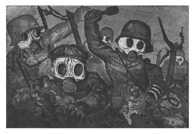
Otto Dix - Stormtroops Advancing Under Gas, etching and aquatint, 1924 (Image source: Wikipedia)

Otto Dix at the Montreal Museum of Fine Arts

Otto Dix - Stormtroops Advancing Under Gas, etching and aquatint, 1924 (Image source: Wikipedia)

Otto Dix - Stormtroops Advancing Under Gas, etching and aquatint, 1924 (Image source: Wikipedia)

Finally, this weekend we made it to the MMFA with my wife to see the Rouge Cabaret: The Terrifying and Beautiful World of Otto Dix. Apparently it’s the first North American exhibition devoted to this German master.

Just to put things in perspective, Dix took part in the World War I as an officer. He documented the horrors he witnessed with a series of drawings and prints. Mass graves, mutilated bodies, decomposed cadavers and injured soldiers became his main subjects.

After the war, during the time of the Weimar Republic, Germany is chaotic, more 2 million soldiers did not returned. Orphans, widows and crippled soldiers were common presence on the streets that became the main inspiration of Dix. Add to this murky cocktail an economic crisis with huge unemployment and the rise of the Nazism and you get a pretty nasty place to live in. Dix is painting the widows, the orphans, the unemployed that are pushed by the force of the times to become prostitutes.

In the exhibition there is a room that is dedicated to the portraits Dix has painted, following the principles of New Objectivity. His models are not just painted with great realism, but because of the colors used and the backgrounds chosen. we get a very good idea of their personality. I really liked the portrait of actor Heinrich George, his posture, the light and the colors present us an extrovert and loud individual.

There were a few things that I found annoying. The works are presented in dim light, to better protect them and the designer of the exhibition is punishing the visitor to read long text written with Impact, a font that is bold, that is narrow and is absolutely inappropriate for long texts. At one point my eyes could not take it any more, I just gave up reading the explanations.

The World War I engravings in the first room were butchered. They should have not squeezed them on two rows. Because of their size, the low intensity of the light (in this particular case it also amplified the dark mood of the subject), for a medium stature person the top row was too high and the bottom row was too low. A short person would have a very hard time seeing anything from the top row. Would they have had an extra wall, they could have presented them on a single row.

When our soldiers are fighting abroad and when we are facing a Global economic crisis, bringing these works to Montreal is a laudable initiative. If you’re a fan of the XXth century art, you should not miss this exhibition. It will be open till January 2nd.

About this website

This website had to fulfill two main requirements, first of all, to be a an online portfolio and second, to serve as my main blogging platform. I’ve had both of these in the past, but they were spread out at different places and different services. I needed something that I can update easily.

I already had some experience with WordPress while working on my watch related website. I really liked the back-end, I found it to be a lot more user friendlier than Drupal and Joomla. Unlike with WatchPaper, I wanted to create theme from scratch, or at least almost from scratch. I started by reading Beginning WordPress 3, by Stephanie Leary, a really good book for discovering hidden aspects of WP. I also had a better understanding of how should I go for the theme development.

My other source of information was the WordPress Codex, a very well written documentation from the WordPress community. I started from the TwentyTen theme, that comes with WordPress, but instead of developing a child theme, I rather used it as a model took bits from here and there. When I got stuck, I would turn to online forums, blogs and articles. Most of the time I would find the answer to my question really fast, proof of the maturity and popularity of this platform.

Some of the features that I needed to look up:

Displaying the image title and description

For the portfolio pages, I wanted to take advantage of the meta info, such as image title and image description that we can add in the back-end when uploading images. Strangely there was no native function to display these, so I needed to find a way to have it written in the functions.php. Luckily I found exactly what I needed on this blog and followed Chris Murphy’s comment, who fine-tuned the solution described by newvibes.

Pagination

I also needed tweaking the pagination and I ended up getting the solution to my problem here.

Considering that I have minimal knowledge of PHP, I’m pretty happy with the result. I know there is still a lot to do, to make it perfect and I’m looking forward to fixing all the bugs that I know of, or that will pop-up as this websites grows.