I remember my first encounter with this logo. It was in the early days of my arrival to Montreal, I was riding the metro and guy next to me had a lapel pin with the rosette without the text. I was wondering about the meaning of it, until later I discovered that it’s actually the logo of the city I lived in.
The more I learned about this logo, the more fascinating I found it to be.
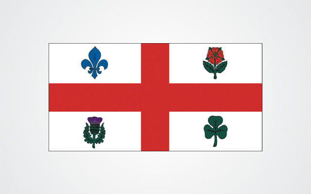
It was designed by the graphic design firm Georges Huel et Associés Inc. and adopted in 1981. The logo is inspired by the city’s coat of arms and its flag, where each petal is formed by the letter V and M, which stands for Ville de Montréal.
Each petal of the rosette is a heart and the four petals allude to the origin of the city, founded by the four ethnic groups, the French, the English, the Scottish and the Irish.

I love this logo, because it’s a rare example of genius visual communication, a unique example of smart simplicity; every element has a meaning, without being noisy.
The same George Huel, is also the author of another logo that marked the history of this city, the logo of the 1976 Montreal Olympic Games.
Find more information about this logo here.
See more graphic design works by George Huel here.


Once a city wins its bid to host the Games, the design and planning begin in earnest. Typically, the official emblem or logo mark is one of the first designs to be finalized and becomes central to all the marketing and development that follows. With such a critical role, these logos are expected to satisfy an overwhelming laundry list of requirements: representing the unique culture of the host city and the entire country, capturing the spirit of the Olympic Games, and functioning as a logo across a broad range of applications, (from tiny postage stamps to stadium scale billboards); and, perhaps most importantly, having the ability to to sell swag. While virtually no emblem could accomplish all of this (after all, it took more than 30 years for Canadians to design a flag that would represent the whole country), for better or worse, each has become an icon of the Games.
1936 Summer Olympics, officially known as the game of XI Olympiad was held in Berlin, Germany. The 1936 Summer Olympics logo was created by the artist, Johannes Boehland. The logo consists of the German Eagle, one of the symbols of city. The inscription on the side of bell “Ich rufe die Jugend der Welt” means “I call the youth of the world” goes along perfectly well with the 1936 Summer Olympics logo design.