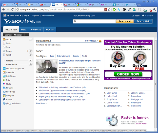
The first thing you see after logging in
Yahoo! is not among my favorite brands online, although I do use it a lot for catching up on international news. I saw on the Yahoo! Mail blog that they are working on a new version and there is a beta out there for the larger public to mess with. You can imagine I could not resist to the temptation to give it a spin. Here are a few impressions:
- The design is bold, in line with the design I saw earlier on the Yahoo! News Canada: dark blue header, a search box that stands out and large tabs that makes navigation easy. I’m not a big fan of Yahoo! News Canada, it always gives me the impression that in terms of content, it’s more like a watered down version of its international counterpart.
- Once I logged in, to my great disappointment, I was still taken to a What’s New section, see the screenshot above. There is a preview of my Inbox, a Top News section, a large (300x250px) ad selling me a gadget to control snoring and a Trending Now block. Apart from the preview of the inbox, all the others are wasting my time. If I log in to my email, I’m expecting to read my emails and not to see the latest news and to find out that Miley Cyrus is trending on Yahoo. The advertisement I can forgive, since that’s the one that pays for my email and let me give here a small tip to Yahoo, I don’t have a snoring problem and I’m not looking to loose weight neither.
- I do like that there is an inbox tab and more especially a contacts tab, with the current official version of Yahoo Mail, it took me months to get used to finding the My contacts link.
- Once you’re inside, they’ve changed the way your online contacts will show and the icons are redesigned.
- The black buttons to write a new message and other actions related to messages selected, I find them too harsh.
- The header of the table that shows the list of messages looks like another email and it’s confusing.
- The flagged messages are somehow better now, because the icon is more visible, but it’s still pushed to the right as the last column and I find that it doesn’t stand out. I flag my messages when I want to remember something, and I want them to stand out next time I log in. I would suggest Yahoo, that apart from having that orange triangle hidden in the extreme right, make the background of that flagged row a different color, maybe a light orange, or a light blue to be less harsh.
- For reading and writing emails, the interface is cleaner, but the black buttons on the top are still ugly…
These are just a few impressions I jotted down, without going into details. It’s still in beta and I can see they put into it a lot of effort to make it more up to date, but someone up there at Yahoo loves clutter and loves noise. The title of this post should be a hint to Yahoo to get rid of the What’s New tab. I’m not sure that clutter and noise is the best differentiating factor for their brand. There is so much talking about the fading importance of emails, that I don’t think they can afford to screw this up.
Do you use Yahoo! Mail? What do you love about it and what would you change?


Where is the online contacts icon?
If you click the Contacts tab, on the left side, in the menu, the icons were new at the time when I wrote this post.