Square Victoria, painting by Adam Sofineti

Square Victoria

Square Victoria, painting by Adam Sofineti

Square Victoria, acrylic on canvas, 30"x40"

When we landed at Dorval at around 6 PM, it was already dark and from airport we headed to my cousin’s place in DDO. Thinking back, as we were drown on the 20 and than on Sources Boulevard, it was no big deal of a cityscape, but I felt a great deal of happiness and I was overwhelmed with a sentiment of accomplishment:

“We did it! We’re now in Canada!”

All the restaurants, car dealers and gas stations looked magnificent in the night.

The next day we wondered out to discover our new neighborhood, in daylight it was even more impressive, with its wide roads and Pharmaprix that had so many hidden treasures. As fearless explorers, we even got as far as the mall, by foot…

It was probably on our third day in Canada, that we decided to go downtown to get our social insurance number and medicare cards. What a ride! We had to take the 208 bus, than the 215 till its terminus and from there to take the metro. So many people, so many different faces, so many different languages, all being so cool, knowing how things work.

“Oh, you have to pull that wire, to get off at the next stop!”

It must be the terminus, everyone is getting off. We just follow them, most of them will take the metro.

We’re in the metro, checking out the map on the wall, we don’t need to change lines, Square Victoria is our stop. More people, more faces, more languages.

Square Victoria

Which exit should we take? Should we go left or right? We go right, till the end of the passage, we get trough the door and… We almost felt on our back as we looked up at the buildings! This is how skyscrapers look in real!

Getting out of the metro at Square Victoria, in February 2003, is a memory I will never forget. I tried to express through this painting the emotions I felt that moment. It was a cold day and there was quite a lot of snow, but this is painting and not a photography of that day.

The New Yahoo! Mail Beta

What’s New in Yahoo! Mail beta

The New Yahoo! Mail Beta

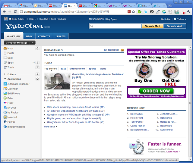
The first thing you see after logging in

Yahoo! is not among my favorite brands online, although I do use it a lot for catching up on international news. I saw on the Yahoo! Mail blog that they are working on a new version and there is a beta out there for the larger public to mess with. You can imagine I could not resist to the temptation to give it a spin. Here are a few impressions:

  • The design is bold, in line with the design I saw earlier on the Yahoo! News Canada: dark blue header, a search box that stands out and large tabs that makes navigation easy. I’m not a big fan of Yahoo! News Canada, it always gives me the impression that in terms of content, it’s  more like a watered down version of its international counterpart.
  • Once I logged in, to my great disappointment, I was still taken to a What’s New section, see the screenshot above. There is a preview of my Inbox, a Top News section, a large (300x250px) ad selling me a gadget to control snoring and a Trending Now block. Apart from the preview of the inbox, all the others are wasting my time. If I log in to my email, I’m expecting to read my emails and not to see the latest news and to find out that Miley Cyrus is trending on Yahoo. The advertisement I can forgive, since that’s the one that pays for my email and let me give here a small tip to Yahoo, I don’t have a snoring problem and I’m not looking to loose weight neither.
  • I do like that there is an inbox tab and more especially a contacts tab, with the current official version of Yahoo Mail, it took me months to get used to finding the My contacts link.
  • Once you’re inside, they’ve changed the way your online contacts will show and the icons are redesigned.
  • The black buttons to write a new message and other actions related to messages selected, I find them too harsh.
  • The header of the table that shows the list of messages looks like another email and it’s confusing.
  • The flagged messages are somehow better now, because the icon is more visible, but it’s still pushed to the right as the last column and I find that it doesn’t stand out. I flag my messages when I want to remember something, and I want them to stand out next time I log in. I would suggest Yahoo, that apart from having that orange triangle hidden in the extreme right, make the background of that flagged row a different color, maybe a light orange, or a light blue to be less harsh.
  • For reading and writing emails, the interface is cleaner, but the black buttons on the top are still ugly…

These are just a few impressions I jotted down, without going into details. It’s still in beta and I can see they put into it a lot of effort to make it more up to date, but someone up there at Yahoo loves clutter and loves noise. The title of this post should be a hint to Yahoo to get rid of the What’s New tab. I’m not sure that clutter and noise is the best differentiating factor for their brand. There is so much talking about the fading importance of emails, that I don’t think they can afford to screw this up.

Do you use Yahoo! Mail? What do you love about it and what would you change?

AdamSofineti.com on Facebook

Why an AdamSofineti.com Facebook page?

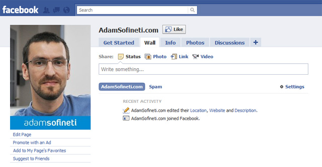
AdamSofineti.com on Facebook

I usually see people creating official Facebook pages, when they reach the limit of friends they can have (5000 on a personal account). It makes sense, the average FB user will never get to that number and I’m not expecting in the near future neither to reach that limit. Why have than a separate Facebook page for this website?

The main reason I did it, is the widget you can see in the left hand, under the Categories section. On my personal account the privacy settings are set in a way to let only my friends have access to my info. This is because I want to keep my Facebook account open only to my friends, in most of the cases people I know personally and in some cases people I would love to meet in person. Adding a “Like” widget would have meant that I have to change my privacy settings and go public, something I refuse to do.

The other option was to create an AdamSofineti.com Facebook page that is public. I changed the syndication settings in my NetworkedBlogs account to feed my blog post from now on to the AdamSofineti.com FB page, so that I won’t spam anyone with my posts showing up twice on their wall.

Quora screen capture

My first impressions about Quora

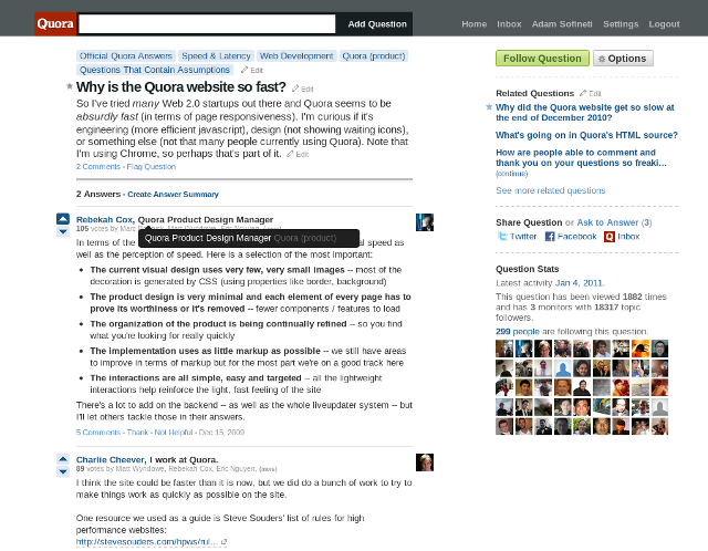
Quora screen capture
Here is Quora, a new kid on the block, whose name keeps popping up in quite prestigious blogs (see a few recommended articles bellow), so I’ve decided to give it a try.

What is Quora

Quora is another Q&A website, a bit like Yahoo Answers, but what I found unique about it, was the quality of the people active on it. Basically there are a bunch of topics and you can ask a question, other users will give answers and again others will vote on those answers. The answers can grow into discussions, giving you access to unexpected insights.

First impressions

The community has that early Twitter feeling to it, bunch of tech pioneers and many of the big gorillas of the tech world are quite active on it.

Unlike Twitter it is very fast, at least for me. I was so impressed that I’ve even found a question on this topic with some interesting details in the answer, but quite frankly by not being a developer some stuff are beyond my understanding.

The design is friendly and while it’s limited in features, what’s there works like a charm, overall I had that feeling that this website will be a place I will come back more than once.

Asking questions

My enthusiasm was watered down quite early, when I tried to ask a question about the way seniors are using Facebook. I kept getting a pop-up with this message:

Learn About Quora Questions Before Adding Yours
Use proper spelling, grammar and punctuation
Quality is important on Quora. Each question should be a complete sentence, with correct spelling, grammar and formatting. It should begin with a capital letter and end with a question mark. Don’t capitalize arbitrary words. If you want to emphasize a particular word or phrase use italics, not ALLCAPS. Avoid profanity.

Pick the question that meets Quora guidelines:
How to make a cheese omelette?
What’s the Best Way to make a Cheese Omelette?
How can I make a good cheese omelette?
for breakfast, how can i make a kickass cheese omelette

This pop-up would keep coming back and I could not post my question, no matter how I would rewrite it. Here is my question rewrote in four different ways:

I would like to know more about the way people aged 65 and up are using Facebook?
What are the most popular features of Facebook with people aged 65 and up?
Are you 65 and up? What do you like about Facebook?
What are the most popular features among seniors using Facebook?

Are my questions really that bad? Is Quora stricter than that English teacher in your worst nightmare? In my opinion the question I tried to ask met their guidelines, it was also a question for what I have a hard time finding answers on Google. I’ve tried contacting Quora trough several channels to ask them for help, but so far I did no get an answer for them. Maybe you can tell me what I did wrong.

Conclusion

I hope with their new found popularity, they will get more feedbacks and they’ll improve the things that need more work. I also hope they will have an iPhone app out soon, because their mobile website is not that great. It’s a website and a community worth checking out!

Recommended articles about Quora

How Quora could get interesting by Chris Brogan
Frequently Asked Questions About Quora on TechCrunch
The Question Of Quora by Mitch Joel

The noxiousness of technology

I stumbled upon an interview with Douglas Rushkoff, a media thinker, who also writes about contemporary Judaism. Here is an excerpt that I find interesting:

Is increased reliance on new technology coming at the cost of spirituality?

Well, the rabbis promoting the oral tradition asked this about the written law, right? New mediating technologies always cost us our intimacy and direct social contact. The less Judaism is about being in a room or under a tent together, the less real it becomes. It’s not that technology costs us spirituality. It’s that the misuse of technology compromises the spiritual components of real life.

This question pops-up everyday and there is always someone to forecast the end of civilization because of the new technologies. Nothing new under the Sun, as Rushkoff points it out, writing has diminished the importance of oral tradition. Since the early forms of writing, someone could sit down and read on his own, get informed, without the need of another human presence. Information could be transfered more easily and more accurately. With the appearance of the printing press, information became cheaper and more accessible. Renaissance and Reformation are all direct results of this technological invention.

Later comes the telegraph, the telephone, Radio, TV, etc. and now we get to use the Internet under its many forms. Social media is among the preferred targets of the naysayers, this week it was the turn of Montreal journalist Pierre Foglia with Expliquez-moi ce rien to express his dislike of Twitter. He complains about the low value of messages that float around the twittersphere, naming the tweets of a humorist, an MP and francophone singer. I won’t try to reply to him here, it was already very well done by the grand dame of Quebec social media, Michelle Blanc on her blog.

My first reaction was, why on Earth someone thinks it’s cool not to get what social media is all about. Than on a second thought, especially after reading some of the comments on Michelle Blanc response, I came to the conclusion that it’s maybe a question of generations. Maybe older people miss those social interactions that were the norm at the time when they were young and now maybe because of the technology, or maybe because of their age, they become more isolated. This gave me the idea of thinking of tools specially built for seniors to initiate them in the usage of social media. There are many seniors who are already present and active on Facebook or Twitter, but for the rest a properly built tutorial would be helpful.

How should this tutorial be built? Should it be a PowerPoit, a PDF or a YouTube video?

St. Patrick’s Day Parade – stop motion animation

Montreal’s St. Patrick’s Day Parade is the oldest in North America and maybe the coolest. I love this event, not just for its cheerful atmosphere, but it also brings a moment of green in our life and it reminds us that the Winter won’t last forever.

Étude de cas EconomicNews.ca

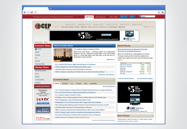
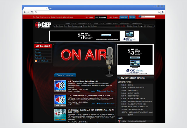
EconomicNews.ca a été le portal des nouvelles macro-économiques de l’agence de presse CEP News. Le site a été mis en ligne au début de l’année 2007 et il a fonctionné jusqu’au mois de mai 2009. Il avait deux sections : CEP News Online, avec des articles et des informations utiles sur l’économie, accessible gratuitement et CEP News Pro, avec du contenu enrichi pour les abonnées.

Au début


Au moment de mon arrivée au CEP News en août 2007, le site Web nécessitait des changements majeurs pour organiser et présenter mieux la richesse informationnelle du contenu.

Le site ne présentait pas une hiérarchie nette de l’information. Ainsi, des articles de fond étaient cachés par des nouvelles d’intérêt secondaire.

Le site était plutôt difficile à naviguer à cause de son menu mal organisé; les articles n’avaient pas des illustrations et cela donnait, à la première vue, une impression générale fastidieuse.

De plus, l’aspect de l’optimisation pour les moteurs des recherche (SEO) avait été complètement négligé.

La marque

Compte tenue du fait que la pierre angulaire de n’importe quel projet en communication est la définition de l’identité corporative et la création d’une stratégie de marketing ancrée dans une image de marque hors de commun, mon but initial a été de créer un nouveau logo et de rédiger un guide des normes graphiques.

Le logo devrait suggérer : The Canadian source of global economic news
Logo CEP News

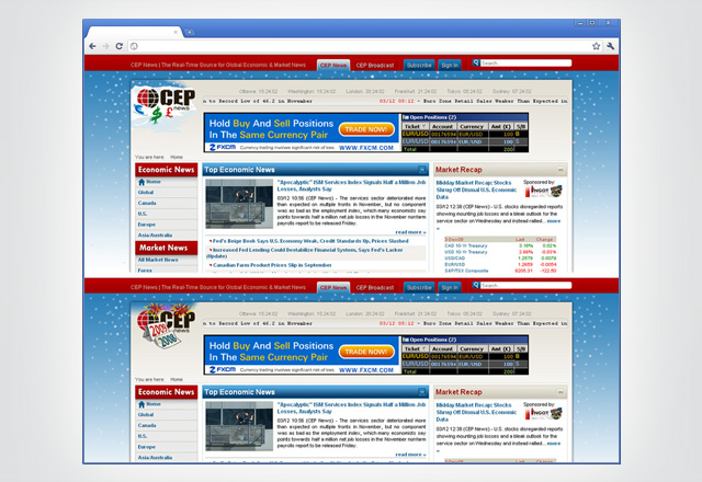
Ultérieurement, ce logo a été remplacé à la fin du 2008 par une nouvelle version afin de représenter mieux l’aspect global de nos nouvelles.
Logo CEP News

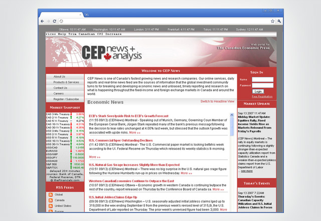
EconomicNews.ca Version 2.0


La mise en page que j’ai proposée visait à corriger les problèmes de l’ancienne version du site. Les couleurs, la proportion des différents éléments, l’organisations des informations ont été changés pour faciliter la navigation des visiteurs. Trouver l’information pertinante dans le plus bref delai est cruciale dans la monde du finance. Ayant cette raison en tête, j’ai redessiné le site.

Pour cette version redessinée, l’équipe avec laquelle j’ai travaillé a utilisé pleinement des techniques Web 2.0, d’un côté, pour organiser mieux l’information et créer des liens entre les différentes sections du site, et d’un autre côté, pour créer l’image d’un site nouveau, moderne et branché.

J’ai créé une base de données avec plus que 500 illustrations, qui a fait la joie des nos rédacteurs et des nos lecteurs.

Le nouveau site a également permis à notre équipe de vente de proposer aux clientes des solutions de publicité en ligne diversifiée et flexible.

Conclusions


À mon arrivée, EconomicNews.ca avait presque 300 visiteurs uniques par jour. Après le lancement de la version 2.0, le nombre de visiteurs a grimpé exponentiellement. Dans les derniers jours du site, EconomicNews.ca recevait chaque jour entre 20 000 et 35 000 visiteurs uniques.

Avoir une mise en page structurant l’information d’une manière logique et une architecture de site facilitant la navigation est un des ingrédients principaux pour être compétitif sur le Web.

Le succès de EconomicNews.ca ne s’explique pas seulement par les changements d’ordre visuel. Une équipe des professionnels du marketing, de la programmation, de l’IT et du design (représenté par le soussigné) a contribué à ce succès. Le visiteur potentiel du site était au coeur des nos efforts. C’est pour lui que nous avons conçu la manière la plus adéquate de présenter le matériel fournis par les excellents journalistes du EconomicNews.ca.

D’ailleurs, l’amélioration d’un site Web est un processus continuel. Car, si d’une part, la technologie est dans un changement constant, de l’autre part, les utilisateurs changent eux aussi leurs habitudes. Bref, pour avoir des résultats optimaux et rester compétitif, un site Web doit suivre ces changements.