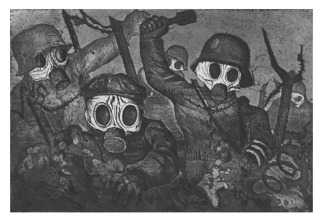
Finally, this weekend we made it to the MMFA with my wife to see the Rouge Cabaret: The Terrifying and Beautiful World of Otto Dix. Apparently it’s the first North American exhibition devoted to this German master.
Just to put things in perspective, Dix took part in the World War I as an officer. He documented the horrors he witnessed with a series of drawings and prints. Mass graves, mutilated bodies, decomposed cadavers and injured soldiers became his main subjects.
After the war, during the time of the Weimar Republic, Germany is chaotic, more 2 million soldiers did not returned. Orphans, widows and crippled soldiers were common presence on the streets that became the main inspiration of Dix. Add to this murky cocktail an economic crisis with huge unemployment and the rise of the Nazism and you get a pretty nasty place to live in. Dix is painting the widows, the orphans, the unemployed that are pushed by the force of the times to become prostitutes.
In the exhibition there is a room that is dedicated to the portraits Dix has painted, following the principles of New Objectivity. His models are not just painted with great realism, but because of the colors used and the backgrounds chosen. we get a very good idea of their personality. I really liked the portrait of actor Heinrich George, his posture, the light and the colors present us an extrovert and loud individual.
There were a few things that I found annoying. The works are presented in dim light, to better protect them and the designer of the exhibition is punishing the visitor to read long text written with Impact, a font that is bold, that is narrow and is absolutely inappropriate for long texts. At one point my eyes could not take it any more, I just gave up reading the explanations.
The World War I engravings in the first room were butchered. They should have not squeezed them on two rows. Because of their size, the low intensity of the light (in this particular case it also amplified the dark mood of the subject), for a medium stature person the top row was too high and the bottom row was too low. A short person would have a very hard time seeing anything from the top row. Would they have had an extra wall, they could have presented them on a single row.
When our soldiers are fighting abroad and when we are facing a Global economic crisis, bringing these works to Montreal is a laudable initiative. If you’re a fan of the XXth century art, you should not miss this exhibition. It will be open till January 2nd.


