As you read this post, the device you use right now has a logo, even the browser. We’re surrounded by logos, they are everywhere and because of their omnipresence, often they are recorded on our brains as simple signs, but they are more than signs, they are symbols. In many cases a logo becomes a symbol because of a coherent brand experience, superior customer service, innovation or quality. There are plenty of logos out there that are worn with pride, almost like talismans, to show the world their wearer is identifying himself with the values of that company.
As a graphic designers, we are often put in the situation to come up with a logo, so every graphic designer has to develop a habit of taking a closer looks at logos. We need to analyze them, to dissect them, to think about colors, shapes, fonts. How do they look big, how to they look at a favicon size (16x16px), will they look good in black and white?
Here are three logos that are inspiring me and I always look up at them as perfect examples of logo design.
The Deutsche Bank

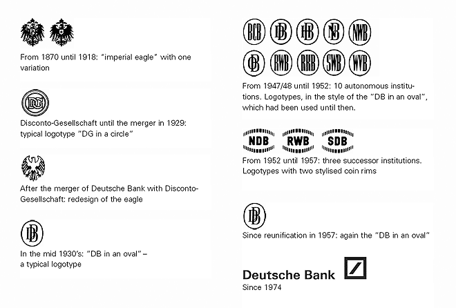
In the early 1970s, some enlightened folks at The Deutsche Bank realized, that their logo does not represent them any more. See bellow the evolution of their logo throughout the years, I think you will agree with them, they badly needed a change.

In 1972, eight graphic designers were commissioned to redesign the logo and the winner was Anton Stankowski from Stuttgart. His logo, I think is the best logo a financial institution could ever get. It’s easy to recognize, it works well in any size and it’s so simple that you wonder how come nobody came up with this idea earlier.
The thick slash symbolizes growth and square is a symbol for security. Your money at The Deutsche Bank will grow in a secure environment.
It’s a simple shape, but as we can see it’s not simplistic, in line with the spirit of Bauhaus, playing with the energy of shapes and eliminating unnecessary elements that would discount the over-all effect.
FedEx

The current FedEx logo is the design of Lindon Leader of Landor Associates, from San Francisco. It’s famous among graphic designers, because of the hidden arrow, between the capital E and the x. It’s something that people rarely notice, but it’s something that works at a subconscious level. It’s a logo that represents speed and dynamism, while being solid and trustworthy.
The Fed is always purple, while the Ex is changing color, depending on the department that will use it.
The Canadian Press

This is probably my favorite Canadian logo. The Canadian Press is a national not-for-profit news agency, who in 2007 went trough a re-branding process. The logo is the work of a Vancouver communication agency, Rethink Communications. The stylized quotation marks with the maple leaf refer to the “Canada” wordmark.
I find it patriotic without falling into kitsch and the quotation marks make reference to the craft of journalism.
These are some of the logos that make me take my hat off. It’s good from time to time to see logos that make you feel good to be a graphic designer.
How about you? What are your favorite logos?

