When will Google ebookstore open in Canada?

Books as we used to know them

In Romania we used to have many books at home. It was in our habit to buy books, read them put them on the shelf and maybe read them again, or maybe just let them collect dust. We had hundreds, maybe thousands of books, not just because both my wife and myself we were teachers, but owning many books was a cultural trait of Romanians.

I think it has to do with the political situation during the Communist time. When everything was censored, the TV was broadcasting only propaganda and there was little mobility, for intellectuals books were an excellent way to escape the absurdity of the moment.

Even after the fall of Communism, Romanians would buy a lot of books; finally you could read all the censored authors, books were still relatively affordable and libraries were a pain to use.

In 2002, when we finally got the Canadian visa, and started selling everything, it was painful to realize how little value our books carried. Nobody would buy them, the second hand bookstores were overwhelmed with books from people leaving the country. I sold hundreds of books literally for pennies, I donated to libraries that would accept them and the rest I still have it in boxes back in Romania, waiting that maybe one day something will happen with them.

This was a painful lesson for me and I told myself that I will never buy books again, unless I have to.

I’m sure other Canadians, not just immigrants, but anyone who had to move realized buying books is not a good idea. Anyone trying to sell their library, realized that  buying new books is a poor investment decision. These are universal truths, not just in Romania or in Canada, but everywhere and I would expect that book publishers and retailers to act accordingly.

Google Books

Google has ambitious plans regarding books. Sean Prpick from CBC, produced a very interesting Ideas show about Google Books called The Great Library 2.0 where he’s talking about the plan of Google to become the modern version of the Alexandrian library. There are some interesting points raised in the show about the possible consequences of letting a private company handle this task.  You can listen to it by subscribing to the Ideas Podcast.

Now that Google has managed to scan a huge number of books, it makes absolute sense to come up with a tool take make all that wealth accessible.

There are many manufacturers, retailers and publishers that came out with e-readers as an alternative to books. Amazon with it’s Kindle, Sony with it’s Sony Reader, or the Nook of Barnes  & Noble are all devices that claim to represent the future of books. I’m not that convinced, if readers are locked into using a device to read their books, we’re back to the same situation as with paper books. These days I would also expect of gadgets to do more than one thing, e-readers have limited functionalities, hence, they are over-priced, bulky and probably, rather sooner than later, will be collecting dust.

The Google ebookstore that was launched a couple of weeks ago is an amazing solution. It offers books for sale without locking you into a single device. Even more, it will help you synchronize among all your devices, so that you can start reading a book on the computer and finish it on your smartphone.

Here is a video demonstrating the features that come with it:

Google ebookstore in Canada

For now if you go on Google ebookstore from Canada, you won’t be able to buy books, only download the free ones. I hope the negotiation of Google with the publishers and retailers will advance faster and I hope that finally they’ll stop pissing against the wind. I would be curios to look at some statistics after this Christmas season about trends in buying paper books versus ebooks.

I’m also looking forward to the time when Canadians won’t have to pay 30% more for a book. Even as the Loonie is on parity with the Greenback, prices of books are still the same as when 1 CAD was .70 USD.

It will be also interesting to follow how Google will manage to give ebook owners true ownership over the content. There are other features that too that will revolutionize reading books. For now it’s not the technology that slows down the progress, it’s rather the mentality and the laws that are slow to adapt to new realities.

Should we be patient and wait while the lawyers get rich? Should we the readers put pressure on the publishers and the retailers to rethink their business model?

Facebook and Twitter search sucks

What I hope 2011 would bring in Social Media

Facebook and Twitter search sucks
I find it really unfortunate that Google missed out on Buzz, although this time it’s less of a failure that Wave was at the time. Buzz is not working, because the social aspect is not evident, you won’t find your friends on it, unless they are geeks and connecting with strangers is not as straight forward as with Twitter. Undoubtedly Google’s strong point is search, no other company is as accurate and as fast in running queries as Google. While Facebook and Twitter are flourishing and don’t seem to slow down in their expansion, they just don’t seem to know how to fix their search.

I really hope 2011 will be the year when all these companies will finally recognize that they are good at some things and for some other things they better let the other do it. There were already some steps taken by Facebook in this direction, when they teamed up with Bing, but there is plenty of work to be sorted out.

Here is my list of search related features I hope they would have:

  • Twitter – first task, sort out that search for once! What do you mean, I can’t search tweets from last week?
  • Twitter – once the simple things are working, let’s start having some fun features, such as searching someone else’s timeline, or searching by date.
  • Facebook – it would be nice to finally have a News Feed search. Sometimes I know of a link or a video I saw someone posted about a month ago, well, finding that is not an easy task for me and I’m not that popular. If I would have thousands of friends, it would be an unimaginable task to perform.

Being able to search our archive of posts on these websites, would make the whole social network experience more meaningful. We’re just shouting, but when we need a relevant information, we need to turn to good “old” Google.

What do you hope 2011 will bring in Social Media?

The Deusche Bank logo

I will take my hat off in front of these famous logos

As you read this post, the device you use right now has a logo, even the browser. We’re surrounded by logos, they are everywhere and because of their omnipresence, often they are recorded on our brains as simple signs, but they are more than signs, they are symbols. In many cases a logo becomes a symbol because of a coherent brand experience, superior customer service, innovation or quality. There are plenty of logos out there that are worn with pride, almost like talismans, to show the world their wearer is identifying himself with the values of that company.

As a graphic designers, we are often put in the situation to come up with a logo, so every graphic designer has to develop a habit of taking a closer looks at logos. We need  to analyze them, to dissect them, to think about colors, shapes, fonts. How do they look big, how to they look at a favicon size (16x16px), will they look good in black and white?

Here are three logos that are inspiring me and I always look up at them as perfect examples of logo design.

The Deutsche Bank

The Deusche Bank logo

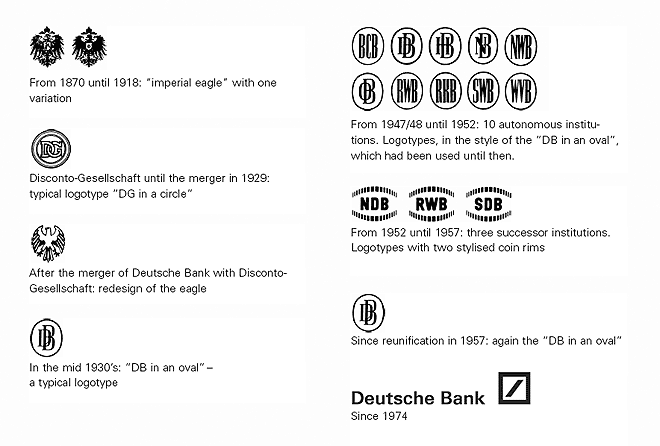
In the early 1970s, some enlightened folks at The Deutsche Bank realized, that their logo does not represent them any more. See bellow the evolution of their logo throughout the years, I think you will agree with them, they badly needed a change.

The Deutsche Bank logo troughout the years

In 1972, eight graphic designers were commissioned to redesign the logo and the winner was Anton Stankowski from Stuttgart. His logo, I think is the best logo a financial institution could ever get. It’s easy to recognize, it works well in any size and it’s so simple that you wonder how come nobody came up with this idea earlier.

The thick slash symbolizes growth and square is a symbol for security. Your money at The Deutsche Bank will grow in a secure environment.

It’s a simple shape, but as we can see it’s not simplistic, in line with the spirit of Bauhaus, playing with the energy of shapes and eliminating unnecessary elements that would discount the over-all effect.

FedEx

Fedex logo

The current FedEx logo is the design of Lindon Leader of Landor Associates, from San Francisco. It’s famous among graphic designers, because of the hidden arrow, between the capital E and the x. It’s something that people rarely notice, but it’s something that works at a subconscious level. It’s a logo that represents speed and dynamism, while being solid and trustworthy.

The Fed is always purple, while the Ex is changing color, depending on the department that will use it.

The Canadian Press

The Canadian Press logo
This is probably my favorite Canadian logo. The Canadian Press is a national not-for-profit news agency, who in 2007 went trough a re-branding process. The logo is the work of a Vancouver communication agency, Rethink Communications. The stylized quotation marks with the maple leaf refer to the “Canada” wordmark.

I find it patriotic without falling into kitsch and the quotation marks make reference to the craft of journalism.

These are some of the logos that make me take my hat off. It’s good from time to time to see logos that make you feel good to be a graphic designer.

How about you? What are your favorite logos?

How to install Java on Kubuntu 10.10

Yep, I have Kubuntu too installed on my machine and I love it. But… There are still some stuff that a newbie like me will find hard to achieve. Sometimes even such obvious task as installing Java will surprise me with some unexpected challenges, but hey, we’re not afraid of them, are we? I could not find the answer on Google, but I was lucky that my good friend Boris gave me a hand. Here are the steps we took to have it up and running:

1. First of all, you want to make sure you don’t have Java installed already. Open the terminal and type:

java -version

In my case, this gave me this output:

The program ‘java’ can be found in the following packages:
* gcj-4.4-jre-headless
* gcj-4.5-jre-headless
* openjdk-6-jre-headless

2. You will need to check if the file /etc/apt/sources.list has these two lines commented out (meaning that they have # in front)

# deb http://extras.ubuntu.com/ubuntu maverick main
# deb-src http://extras.ubuntu.com/ubuntu maverick main

3. If that’s the case, you’ll have to go back to your terminal and type:

sudo kate /etc/apt/sources.list

This will open the same file in Kate, but you’ll have writing privileges. Find the above two lines and remove the # in their front and save the file.

4. Go back to the terminal and type:

sudo apt-get update

5. Type:

sudo apt-get install sun-java6-jdk

It will ask you if you’re OK to install Java that will take up a bunch of space on your hard drive, you should press the y key to agree and continue.

6. At the end you will get a window with the licence agreement, to get to press the OK button, you first have to hit the Tab key and than press Enter.

That was it for me, I hope it will help you.

Update
In case it doesn’t work for you, in step 3. uncomment:

deb http://archive.canonical.com/ubuntu maverick partner
deb-src http://archive.canonical.com/ubuntu maverick partner

Thanks Lars for the feedback!

How undergraduate students use the Web

The Nielsen Norman Group has released a new study yesterday, that is taking a look at how college students (18 to 24) use the Web. Some of the results are confirming my expectations: social network websites are not everything when it comes to the Web. Here are the main points of the findings:

  • Students are not necessarily technology experts – they are less intimidated by technology than older folks, but assuming that they know everything and they are willing to try out anything is wishful thinking. Interfaces that look intimidating, are usually ignored for fear of wasting time.
  • Multimedia should be used cautiously – Websites that play music or a flashing animation after load are considered to be of low quality.
  • Simple interfaces are preferred – here’s a quot that summarizes well this point: “stick to simplicity in design, but not be old-fashioned. Clear menus, not too many flashy or moving things because it can be quite confusing.”
  • They use social networks, but it’s not everything – most of them tend to keep one or two tabs open with a social network website, but when it comes to finding more detailed and accurate information, they will turn to search engines.
  • Reading – Long walls of text are intimidating, they prefer pages that are easy to scan. Many of them have trouble following a text with long paragraphs and complicated sentences.
  • Age-appropriate content – The younger the age group of your audience, the more important it is to better target the content and the interface. When it comes to students, of course this task is easier than with 7-year-olds. Still the results of the study advise having a special section of your website if you want to appeal to this age group. For example if a company would be interested to attract interns or graduates, they should not write the job description the same way as they would for others.
  • Students have a an eye for ads – they are fast to spot an advertorial, not easy to be fooled with cheap tricks.

The study claims that there are no international differences, something that I have a hard time believing. It was conducted in North America, Europe and Australia, well, there is more to the World than that and especially when it comes to UI design, culture can have a big impact on the perception of a website. Another thing I missed from this study is the lack of mentioning of the Mobile Web. With all the smartphones and tablets would have been interesting to find out about their use by this age group.

The other day I was reading Google and the Rise of Facebook, by Brian Solis. He is seeing Facebook as the dominant presence on the Web, dethroning Google. He gives numbers and statistics of time spent on Social Network websites to support his argument. At the time I was uncomfortable with his argument, but now with these results from the Neilsen Norman study, I know what was the weak point in Brian Solis’s theory. The time spent on social networks is irrelevant, because the users might keep a tab open with Facebook all day long, or might be 24/7 connected trough a smart phone. The same way I could claim that we’re always on Google because our default search engine in our browsers is set to Google.

The way how Social Networks are used, or the purpose they are used for, is more important than how many people spend how much time on them.

The battle with cancer

I just learned about the death earlier this month of Montreal musician Catherine Potter. While Googling to find more info about her, I came across this article in The Gazette:
Musician Catherine Potter fused East, West and the first paragraph caught my attention:

The world beat music community is reeling from the death of Canadian artist Catherine Potter, who dedicated her life to the creation of a unique musical identity based on the fusion of classical Indian and western (jazz) music. She lost her battle with breast cancer on Dec. 3, at the age of 52.

It’s me who made that bold, because this expression “lost her battle with cancer” is something we hear every day, when news breaks out of a famous person dying of a disease. I think it’s totally unfair to say that someone lost a battle with cancer, it’s like blaming that person for giving up, almost presenting them as a looser, while us, the rest of the society, we have nothing to do with what happened. If civilians are killed in a war, we don’t say that they lost the battle, the same way we should not use this expression for people succumbing to a medical condition.

I had family members and friends who died because of cancer and let me tell you, I can say anything about them, but not that they were losers.

Since the English language seems to be so attached to this expression, let’s see who are the real losers in the battle with cancer. First of all, I would point to the medical science community, that still could not find a cure to many forms of cancer. Don’t get me wrong, I don’t blame them, we’re talking here about a battle, about war and in war sometimes you just can’t win; it’s not your fault, but you can’t, at least not easily. But I’m optimistic, I’m sure with time, doctors will learn more and more and as a society we’ll get to a point where cancer will be curable.

Another loser in this battle, who unlike the medical science community, it often prefers to shy away from responsibilities, is the Government. We don’t have to search far back in the past, let’s just take what happened yesterday, when the Conservatives refused to commit to increasing the size of the warning labels in the cigarette packages. They’ve spent 3,6 million on a research to find out the current labels designed back in 2001 are outdated. Big surprise!! What will be their next focus? Fighting contraband cigarettes!

According to this Health Canada page, in 2001 the Canadian tobacco industry employed 2,135 people. It really looks like an important field, who’s interest should prevail over the general health of Canadians.

I’m curios what will be the numbers, when we’ll find out how much the Government has spent to educate us about the dangers of smoking contraband products. Next time you hear someone “has lost battle with cancer”, think a bit beyond the surface of the words.

Let me finish it on a more positive tone, here is an excerpt from a performance of Catherine Potter from 2007.

FXessentials logo designed by Adam Sofineti

FXessentials logo

FXessentials logo designed by Adam Sofineti

This is a logo that I’ve created for my friend Eric, who’s the editor of FXessentails.com, a website about foreign exchange news.

I really like the name of this website and while designing the logo, I tried to reduce things to the essence, hence the minimalist approach. The lower case “f” with two lines is alluding to both the British Pound and the Euro sign. The “fx” is using Times New Roman, a classic font that I’ve chosen to express the serious approach of Eric to the subject, while the “essentials” is using Sansation, a very modern looking sans serif to symbolize the freshness of the news.

The immigrants

One of my resolutions for 2011 is to get back into painting. You will see more paintings and probably more stop motion animations like this, coming in the near future.

Otto Dix - Stormtroops Advancing Under Gas, etching and aquatint, 1924 (Image source: Wikipedia)

Otto Dix at the Montreal Museum of Fine Arts

Otto Dix - Stormtroops Advancing Under Gas, etching and aquatint, 1924 (Image source: Wikipedia)

Otto Dix - Stormtroops Advancing Under Gas, etching and aquatint, 1924 (Image source: Wikipedia)

Finally, this weekend we made it to the MMFA with my wife to see the Rouge Cabaret: The Terrifying and Beautiful World of Otto Dix. Apparently it’s the first North American exhibition devoted to this German master.

Just to put things in perspective, Dix took part in the World War I as an officer. He documented the horrors he witnessed with a series of drawings and prints. Mass graves, mutilated bodies, decomposed cadavers and injured soldiers became his main subjects.

After the war, during the time of the Weimar Republic, Germany is chaotic, more 2 million soldiers did not returned. Orphans, widows and crippled soldiers were common presence on the streets that became the main inspiration of Dix. Add to this murky cocktail an economic crisis with huge unemployment and the rise of the Nazism and you get a pretty nasty place to live in. Dix is painting the widows, the orphans, the unemployed that are pushed by the force of the times to become prostitutes.

In the exhibition there is a room that is dedicated to the portraits Dix has painted, following the principles of New Objectivity. His models are not just painted with great realism, but because of the colors used and the backgrounds chosen. we get a very good idea of their personality. I really liked the portrait of actor Heinrich George, his posture, the light and the colors present us an extrovert and loud individual.

There were a few things that I found annoying. The works are presented in dim light, to better protect them and the designer of the exhibition is punishing the visitor to read long text written with Impact, a font that is bold, that is narrow and is absolutely inappropriate for long texts. At one point my eyes could not take it any more, I just gave up reading the explanations.

The World War I engravings in the first room were butchered. They should have not squeezed them on two rows. Because of their size, the low intensity of the light (in this particular case it also amplified the dark mood of the subject), for a medium stature person the top row was too high and the bottom row was too low. A short person would have a very hard time seeing anything from the top row. Would they have had an extra wall, they could have presented them on a single row.

When our soldiers are fighting abroad and when we are facing a Global economic crisis, bringing these works to Montreal is a laudable initiative. If you’re a fan of the XXth century art, you should not miss this exhibition. It will be open till January 2nd.

About this website

This website had to fulfill two main requirements, first of all, to be a an online portfolio and second, to serve as my main blogging platform. I’ve had both of these in the past, but they were spread out at different places and different services. I needed something that I can update easily.

I already had some experience with WordPress while working on my watch related website. I really liked the back-end, I found it to be a lot more user friendlier than Drupal and Joomla. Unlike with WatchPaper, I wanted to create theme from scratch, or at least almost from scratch. I started by reading Beginning WordPress 3, by Stephanie Leary, a really good book for discovering hidden aspects of WP. I also had a better understanding of how should I go for the theme development.

My other source of information was the WordPress Codex, a very well written documentation from the WordPress community. I started from the TwentyTen theme, that comes with WordPress, but instead of developing a child theme, I rather used it as a model took bits from here and there. When I got stuck, I would turn to online forums, blogs and articles. Most of the time I would find the answer to my question really fast, proof of the maturity and popularity of this platform.

Some of the features that I needed to look up:

Displaying the image title and description

For the portfolio pages, I wanted to take advantage of the meta info, such as image title and image description that we can add in the back-end when uploading images. Strangely there was no native function to display these, so I needed to find a way to have it written in the functions.php. Luckily I found exactly what I needed on this blog and followed Chris Murphy’s comment, who fine-tuned the solution described by newvibes.

Pagination

I also needed tweaking the pagination and I ended up getting the solution to my problem here.

Considering that I have minimal knowledge of PHP, I’m pretty happy with the result. I know there is still a lot to do, to make it perfect and I’m looking forward to fixing all the bugs that I know of, or that will pop-up as this websites grows.